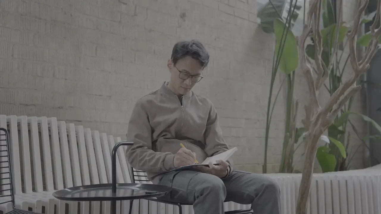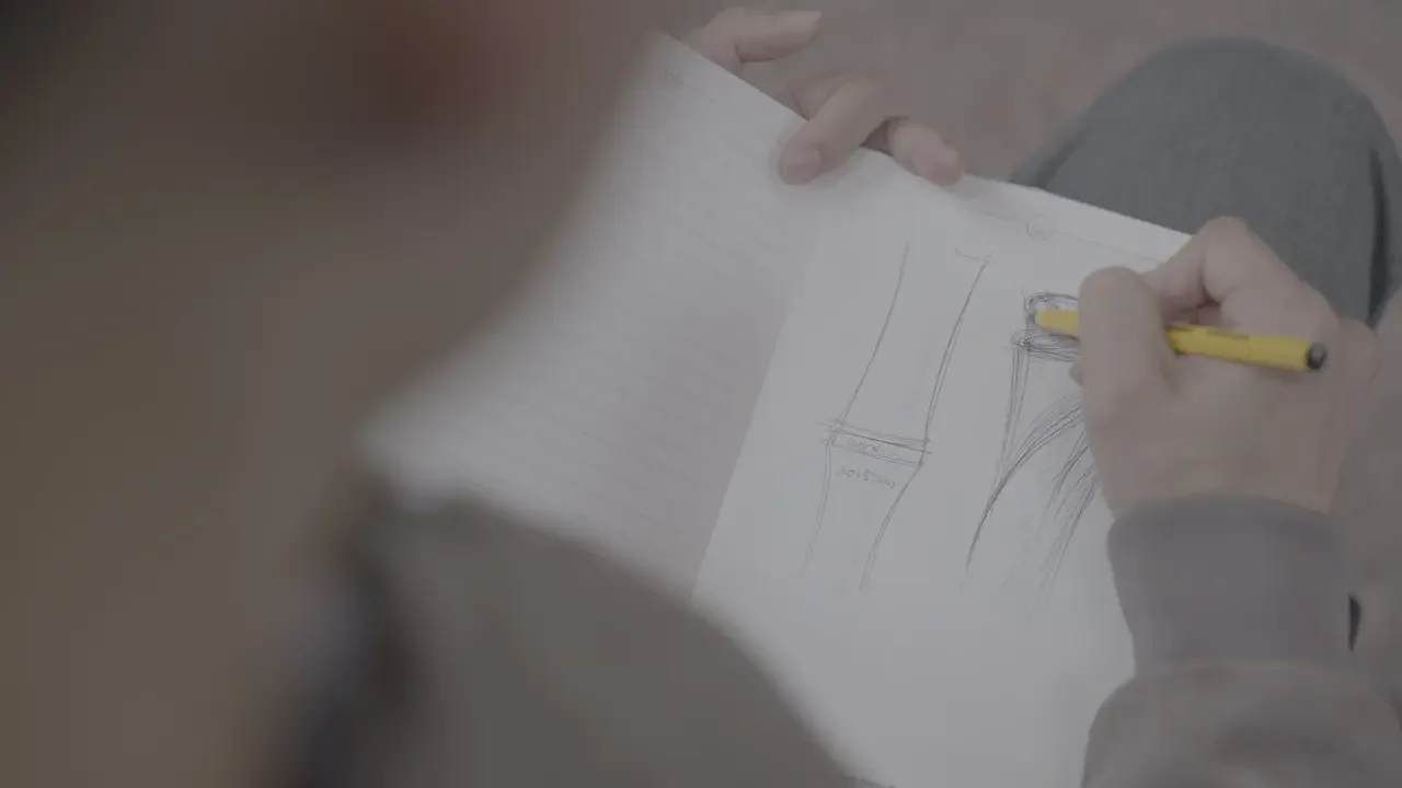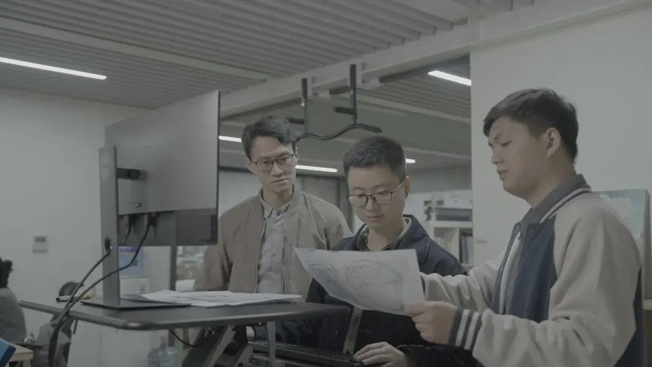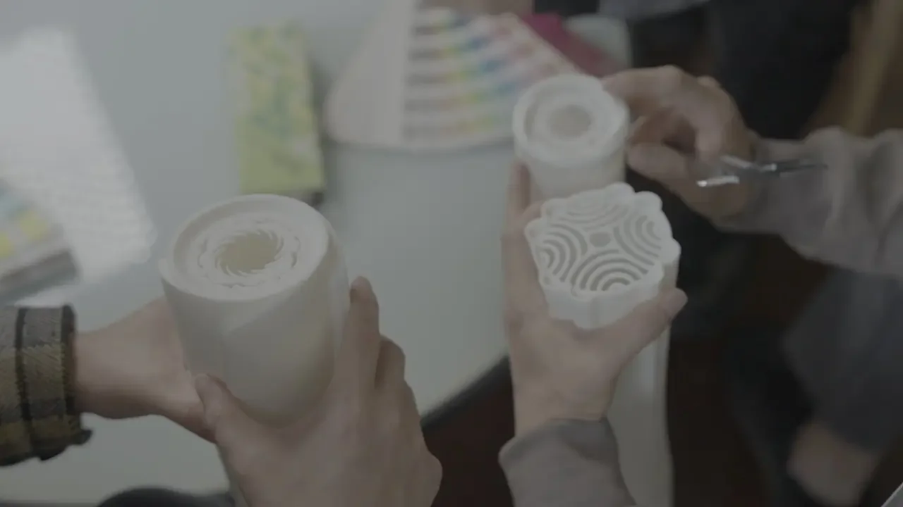
The moment we received the invitation to design the World Games torch
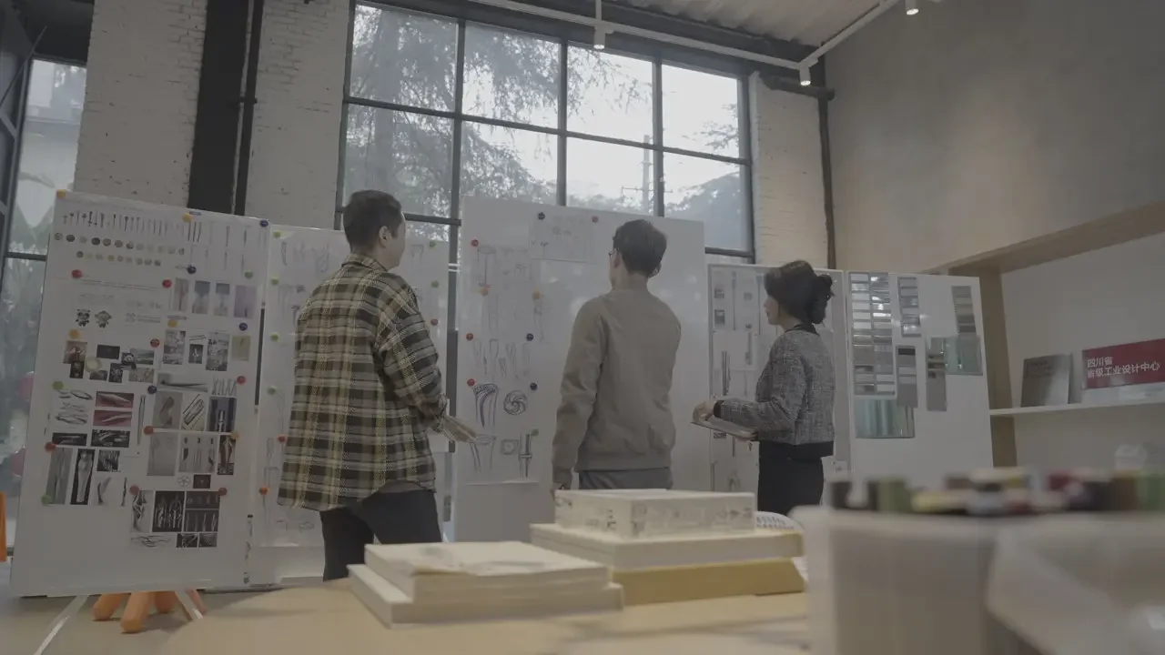
The moment we received the invitation to design the World Games torch, our team set the design direction, following…
The moment we received the invitation to design the World Games torch, our team set the design direction, following the World Games' philosophy and vision: 'athlete-centered, providing a stage for self-expression and full performance.' We balanced an international perspective, Chinese characteristics, and Chengdu flavor. We also developed a deep understanding of ancient Shu civilization and Tianfu culture, so the work could fully express Chengdu's unique character and charm.
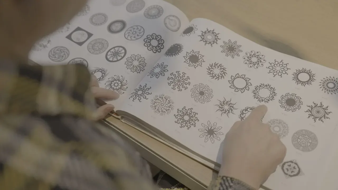
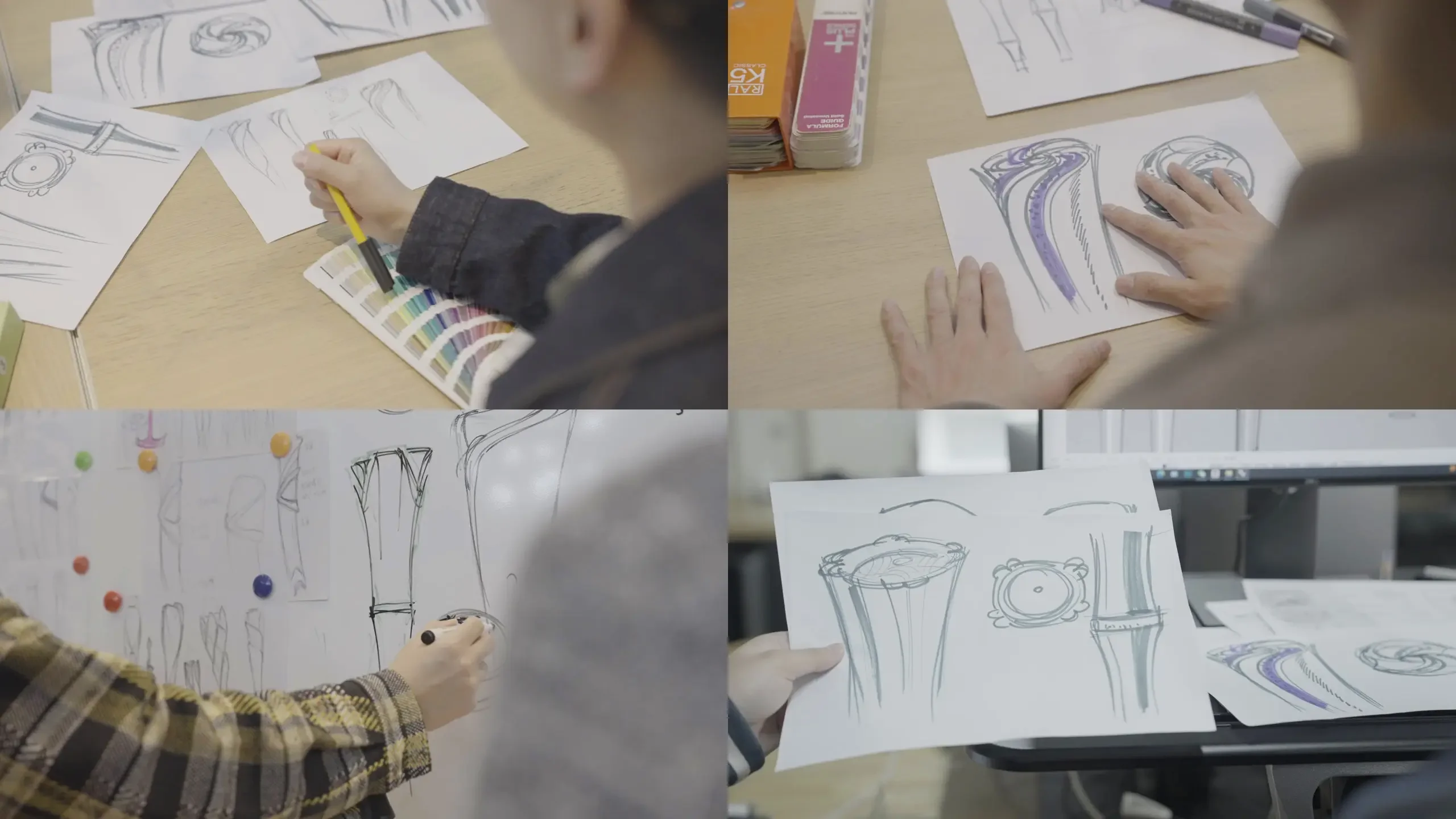
'Root-seeking'—looking for clues in Chengdu's cultural fabric: the full bloom of the city flower, hibiscus; the cultural imprints of Shu brocade and Sanxingdui; the Sun and Immortal Bird of Jinsha; and the city's distinctive everyday vitality. These elements are not a pile of symbols but a formal language: the flower suggests upward openness, fire suggests movement and passion, light suggests contemporary texture, and the vessel emphasizes grip and proportion.
Entering the concept divergence stage, we explored four paths in parallel:
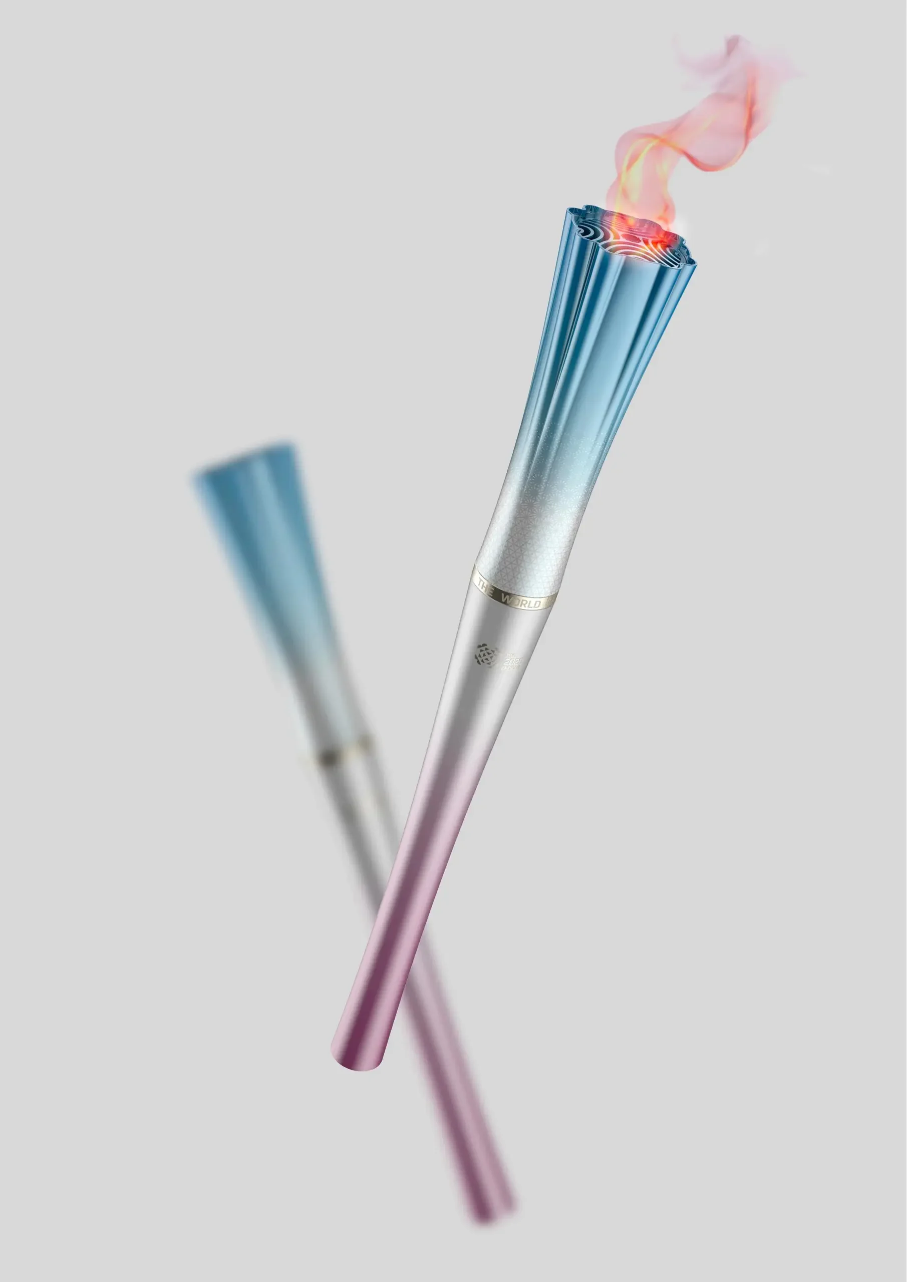
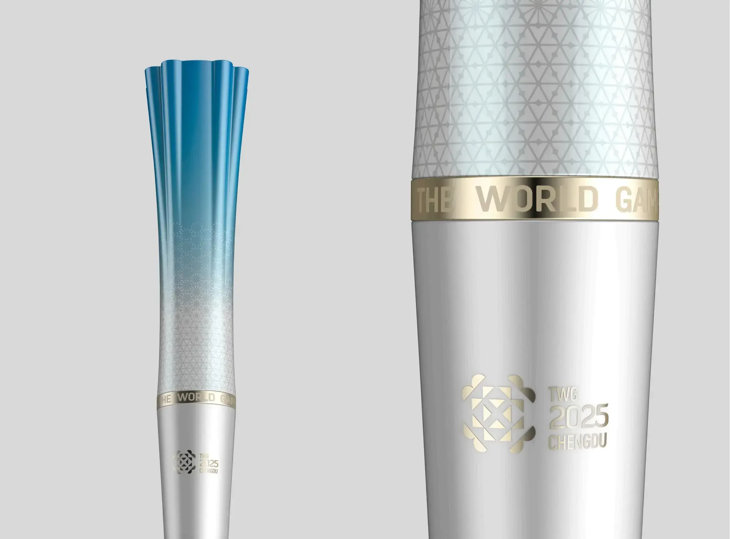
'Rongyao': flower and fire share one structure, opening upward from bottom to top; the top resembles both petals and flame, distilling 'Chengdu shining';
Full Bloom
'Full Bloom': emphasizing a tribute to flowers, with the flame outlet blooming like fireworks: 'Full Bloom': emphasizing a tribute to flowers, with the flame outlet like fireworks…
'Full Bloom': emphasizing a tribute to flowers, with the flame outlet blooming like fireworks;
'Shu Glow': minimalist silver-white, geometric cutouts responding to ancient Shu civilization;
'Blossom': hibiscus and the Sun and Immortal Bird interweave, expressing the city's vitality.
Through continuous iterations, we repeatedly refined proportion, center of gravity, and hand feel: a 1:1 sample was used to verify weight and comfort; the handle curve ensures long periods of grip without fatigue; the openings at the flame outlet need both recognition and heat resistance and strength. In the end, a gold-to-cyan gradient became the 'Chengdu color palette'; red represents honor, cyan represents nature and ease, complemented by precision CNC and gradient coating, giving the torch flowing layers in light.
Finally
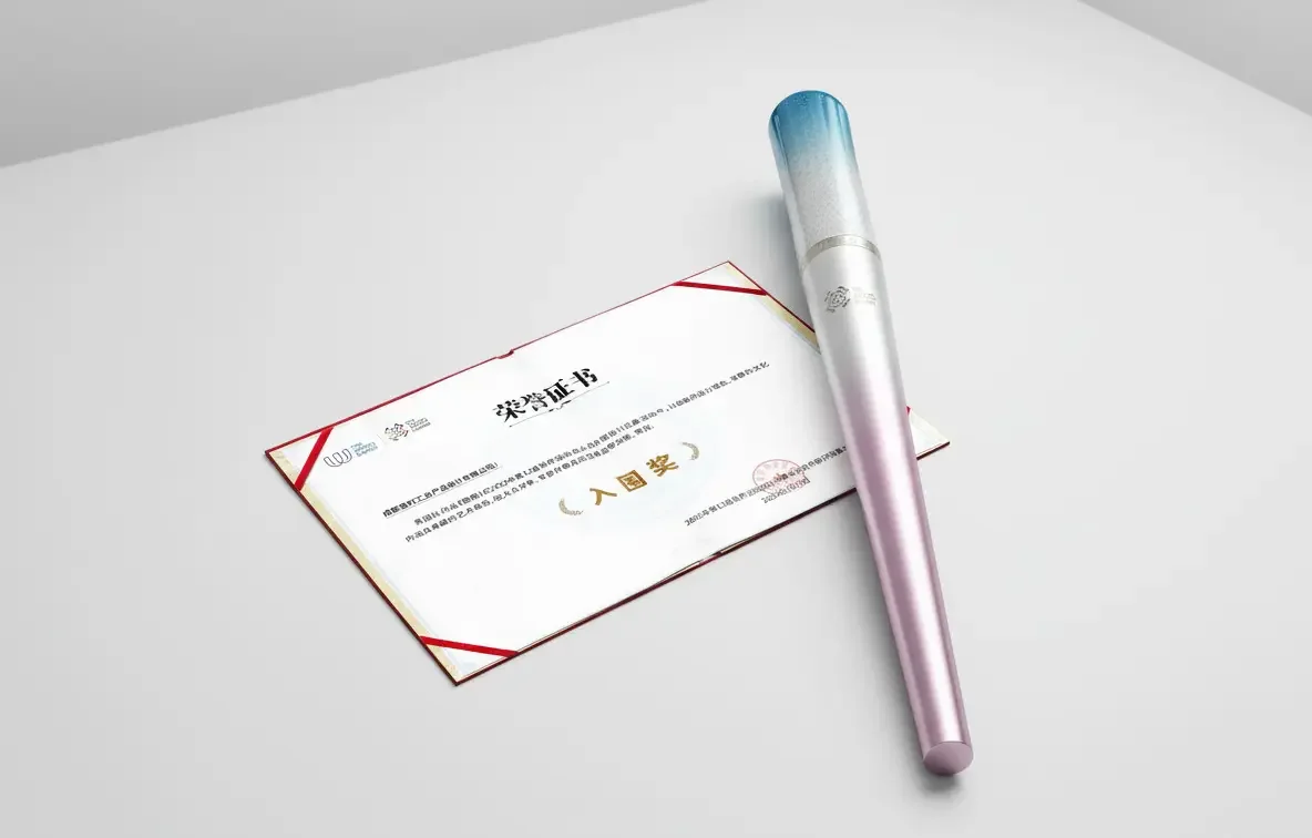
Finally, 'Rongyao' was shortlisted as a core concept, standing out among more than 270 works.…: Finally, 'Rongyao' was shortlisted as a core concept, among 2…
Finally, 'Rongyao' was shortlisted as a core concept, standing out among more than 270 works. It is not only a carrier of flame but also a symbol of Chengdu. At that moment, we believed: what design leaves behind is not only form, but a handshake between the city and the world.
The team began with cultural tracing, extracting hibiscus, Shu brocade, Sanxingdui, the Sun and Immortal Bird, and everyday street life as key symbols, and transformed them into a formal language: flower for growth, fire for passion, light for modernity, and vessel for function.